Good Design vs. Bad Design
It doesn’t seem to matter how much technology advances. There are still little goofy nuances that come with all this rapid progress. There are always quirks and things that, on the grand scheme of things, are nothing. Just having a roof over our heads and running water is far more than we could ask for. But as technology has advanced, there’s been an increasing number of modern conveniences, all here to make our lives better. So by no means is this the end of the world.
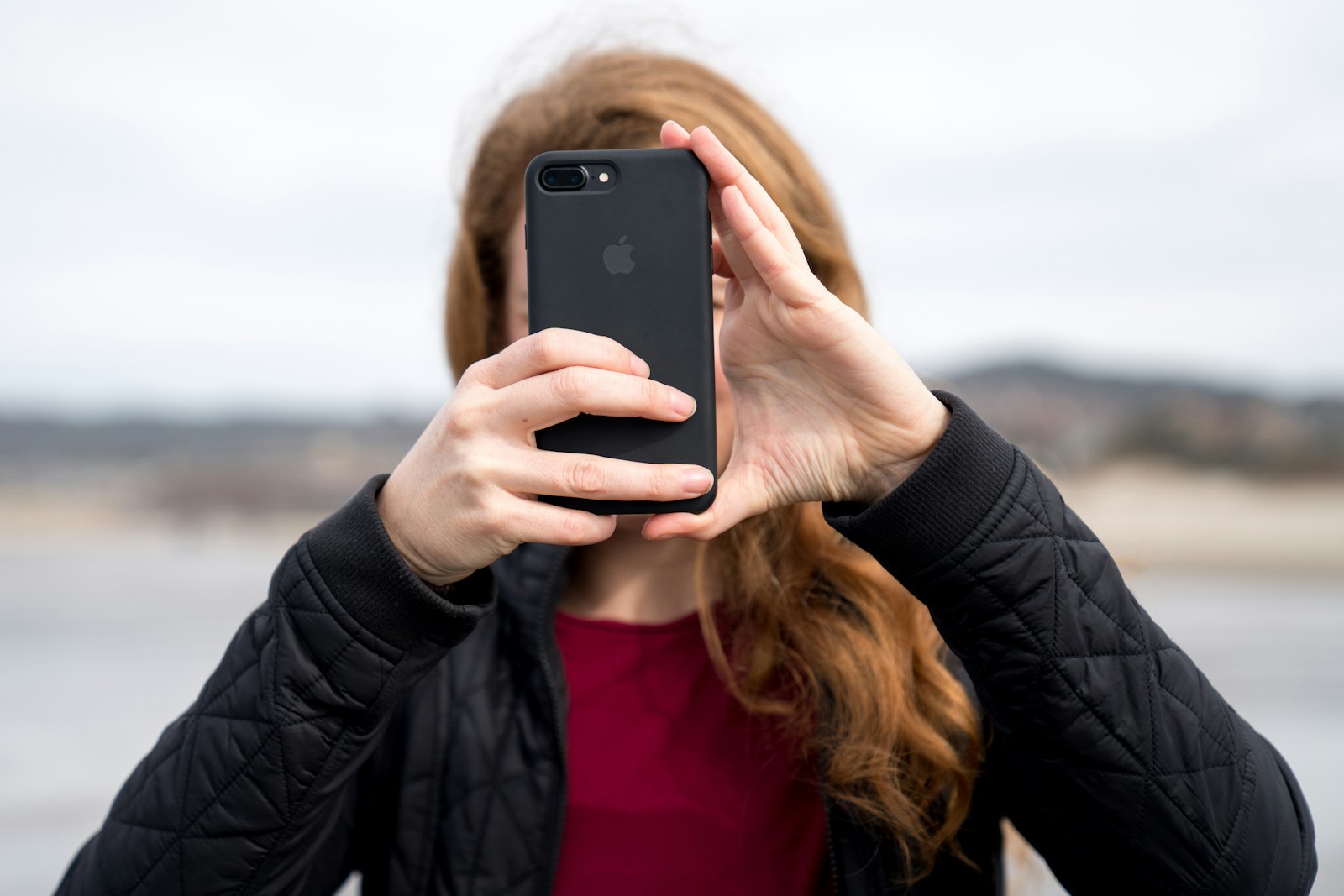
But have you ever been using your iPhone, with Face ID enabled, and you receive a message that says, Please type in your password to enable Face ID?
I want you to stop and think about that for a moment from the perspective of design.
Why does Face ID exist? It exists to prevent you from needing to type in your password. So what good is it if it requires you, on a regular basis, to type in your password?
Most Designers Don’t Know What Design Is
One of the things I’ve realized throughout the years, as somebody who has been in some capacity of graphic design for over 20 years, is that I’ve found it extraordinarily difficult to partake in any type of design publication or be a part of a design-centric community. The biggest reason for this is because the vast majority of designers I’ve ever read articles from have absolutely no idea what design is.
If you ask the average graphic designer what design is, they’re going to talk to you about fonts. They’re going to say something about layouts. If they’re a little bit more savvy, they won’t say fonts. They’ll say typeface, and they’ll give you specific details about kerning and letter spacing and the nuances of typography, which is an art all on its own. Some designers will talk to you about trends. Others will talk about color.
But what few will ever talk about is what design actually is.
All of those things, typefaces, colors, layouts, composition, balance, they’re all a part of design, but they are not design itself. I would argue they’re a very, very tiny minority part of design, maybe four or five percent of what it really is.
Design has very little to do with the way something looks. To paraphrase Steve Jobs, it has far more to do with the way something works. In the realm of the web, good design makes it simpler for people to find what they’re looking for or complete a particular objective. It removes friction from the user so that getting from point A to point B is faster, and sometimes even more fun, than the alternative.
That is the core of what design is.
“But That’s Usability Design, Not Design”
Some people will say, “No, that’s usability design. That’s not design.” But this is where you’d be wrong. Even if we were to go back in time, when the vast majority of marketing efforts were direct mail, I would argue that good design was not about composition. It was not about layout. It was not about catching someone’s eye. It was about being effective at conveying an idea. It’s far more than the typeface, far more than the color, far more than the size of the document. It’s what the headline says. It’s what the call to action is. It has little to do with how pretty it is.
What do you think would convert better? A postcard that says “Go to this URL and get a free iPad,” only it’s in Times New Roman and Comic Sans with a rainbow background? Or something ambiguous and meaningless, but perfectly tuned with a modern typeface and a perfectly curated color palette?
The former, of course. Because everybody wants the iPad. That’s good design.
Good design comes first when it serves the person who’s using it. Does that mean giving away a free iPad is always the best business move? No, by no means. But good design places the user as the most important person in the equation.
When a designer says it’s fonts, it’s colors, it’s typography, it’s layout, it’s this design trend, what they’re really saying is, “My personal tastes are of more value than the interests of the person who’s using this.” And that’s why you’ll find so many designers who will talk to you about all the visual things and never even mention what actually matters.
The Medium Doesn’t Matter
I mention direct mail and print because I think there’s this romantic idea that creating a logo, a shirt design, or a billboard is somehow different than things on the web, that it’s somehow more real design. But it isn’t. Whatever the medium, the act of design is the same. It’s simply crafting something that is meant to serve a particular purpose for a particular person or people.
That’s what good design is. And I’d argue that’s just what design is, period.
Back to Face ID
So why did I mention that thing earlier with Face ID? Now that I’ve articulated what good design is, you’ll notice that when I talk about having to type in your password to enable Face ID, nowhere in that equation is the font, the color, the layout, the structure. What I’m talking about is a particular act, a feature, or lack thereof.
What’s ironic about Face ID is that rather than making it easier for you to unlock your device securely, all they’ve really done is add an extra step. They’ve made it seem more futuristic and interesting, but in reality, they’ve made it harder to use.
This is bad design.
Everyone Understands Design Except Designers
Here’s a random thought, but it’s one worth making: I think you’re far more likely to get an accurate understanding of what design is from every person in the entire world other than a graphic designer.
The average person who’s purchased something on Amazon that takes five times longer to put together than they thought it would, or something from IKEA, and after their second hour they realize they’re two screws loose, what they’d probably say is, “This thing is just badly designed.” And with that, they’d have a better understanding of what design is than 99.999% of designers.
My goal here isn’t to make fun of designers. Of course, I am one, just in the sense of the actual word. While I do enjoy a good typeface, a good color palette, and masterful composition, I will never have and never will put that above what design truly is.
Apple and the Decline of Good Design
Part of the reason I’m picking on Apple is because for years they’ve been known as one of the leaders and innovators in design. And during the time of Steve Jobs, that was largely true. Leaps and bounds were made, not only with the Mac, but with the iPhone, the iPad. A lot of things moved forward quite rapidly because of Apple’s dedication to design.
Only in the last five to ten years have we started to see that unwind and unravel a little bit. I don’t know if anyone in particular is responsible for that, but it serves as a good illustration of what is and is not good design.
Touch ID Was Better
I’ve harped on this idea of having to type in your password to enable Face ID. Some people would come back and say, “Well, you don’t have to do it every day. It’s only occasionally. It’s not that big of a deal. Besides, I save a lot of time unlocking my phone with my face rather than typing my passcode.” And I think that’s a fair and valid argument.
However, there is another element to this that I do not feel is in any way defensible from a design standpoint, and that is the comparison between Touch ID and Face ID.
Touch ID was the predecessor to Face ID. Back when iPhones were Touch ID enabled, the screens were a little smaller because there was a dedicated home button below the screen. You could actually, tactilely, click this button to go back home. Now, this is a personal preference, and I’d understand if people disagree, but I felt that was actually easier than having to swipe up from the bottom.
But that’s not my main qualm. What I’m using as an argument for bad design is comparing Touch ID to Face ID directly.
With Touch ID, you didn’t have to have the phone in front of your face. It could be in your pocket. It could be at your side. And best of all, if you’re like me and you have glasses, you could have them off and it would still recognize you, because it just needed your thumb. If it was in your pocket, or you were walking somewhere, or you were busy, the fact of the matter is, it was significantly easier to unlock your phone with your thumb than with your face. I don’t think there’s anybody who would dispute that.
So why add Face ID?
I don’t know why they decided to switch. It is, in every way, worse than Touch ID for the function it serves. I’m just thankful the laptops still have Touch ID and haven’t switched to Face ID, because I don’t have to position the screen or my face in a specific way to unlock my laptop.
A Solution in Search of a Problem
This is completely a guess as to why they switched, but in my personal opinion, when I first saw and used Face ID, it felt like what so many designers do when they enter the realm of design: they create a solution in search of a problem.
They create something that doesn’t really solve a problem but just makes them, and the user, kind of feel something. I think that’s what Face ID really is. It seems more futuristic to have your face scanned than to rest your thumb on a button. After all, that technology had been around for years. Having your face scanned, however, feels somehow far more futuristic.
It’s a feeling. It makes the product measurably worse, but if it makes you feel something, then they’ll sacrifice design for the sake of the feeling.
This is what we see so often with designers. They think the body copy, the headline, or how easy something is to use can be sacrificed for the sake of typefaces, colors, and layout.
Why This Matters to You
Why does all of this matter to somebody who isn’t a designer?
I think it goes back to a solid and fundamental misunderstanding of what design is. The reality is, everybody is a designer. You might not be a graphic designer, you might not be a software designer, but it’s pretty likely that you design something. And part of being good at that, particularly in the realm of business, is understanding the practice of design. Whether you design content, spreadsheets, or processes for customer service, at the core of it is design.
My argument here, though it might have been built on a smaller, less important example like Touch ID versus Face ID, is this: good design, in whatever medium, on whatever platform, and in whatever business, is the art and craft of serving other people. It’s putting other people’s interests and needs above our own and finding the best possible way to craft something that serves the people we are in business or practice to serve.
I think that’s one of the reasons, at the core, why so many designers aren’t really designers at all. Personal preference and taste trumps everything, when in reality, it is the customer. It is the client. It is the user. And the more we shift our focus to serving them, the better designers we will be.